

Stop Prioritizing Fees Over Donor Experience
Your nonprofit fundraising strategy is probably losing money, and it’s not because donors don’t care.
It’s because your donation experience is harder than it should be.
I see this constantly. A leadership team is evaluating a fundraising platform, and the conversation immediately goes to cost. What are the fees? Is there a free option? Does our CRM already include something we can use?
Those aren’t bad questions. They just shouldn’t be the first ones.
Your donation form is not an internal systems decision. It is a donor experience decision. And if you care about donor retention, long-term growth, and building real trust, that distinction matters more than most nonprofits realize.
Your Donation Form Is Part of Your Nonprofit Marketing Strategy
Most organizations treat the donation form like plumbing. Marketing drives traffic. Development writes the appeal. Finance manages processing. The form itself is assumed to be neutral.
It isn’t.
Your donation form is the final step in your nonprofit marketing strategy. It’s the moment someone decides whether giving feels simple and aligned or confusing and transactional. That experience shapes how they feel about your organization long after the credit card clears.
Before choosing a fundraising platform, you need to understand how your donors actually give. Are they clicking from mobile? From Instagram? From email? From QR codes at events? Are you running high-volume campaigns that spike traffic, or do most gifts come through a steady, evergreen giving page?
If you don’t know how your donors behave, you’re choosing tools blindly.
I’ve seen two organizations with similar audiences, similar missions, and similar messaging produce wildly different results online. One raised $5,000. The other raised $50,000. The difference wasn’t storytelling. It wasn’t urgency. It was ease. One donation experience felt seamless. The other felt like work.
Donors give when it’s simple.
Why I Recommend Donorbox for Small to Mid-Sized Nonprofits
If you follow me, you know I’m a fan of Donorbox. Yes, I use an affiliate link. I’m transparent about that.
I recommend it because it prioritizes the donor experience first. It embeds directly into your website, which keeps donors in a familiar environment. It supports Apple Pay, Google Pay, PayPal, and Stripe, so people can give the way they already pay for everything else. It makes recurring giving obvious and easy, which is essential if you’re serious about strengthening donor retention.
On the backend, it’s manageable. When we hand off websites to clients, they can actually update and maintain their donation pages without hiring outside support every time they want to make a change. That practicality matters for small and mid-sized teams.
Does it have fees? Yes. Most legitimate fundraising platforms do.
The better question is whether the platform converts well. If a slightly higher fee platform improves completion rates and increases recurring gifts, you net more revenue. Saving a small percentage while losing donors mid-form is not a smart nonprofit fundraising strategy.
The “Free” Platform Conversation
Let’s address Zeffy.
Zeffy advertises zero platform fees, which sounds appealing. For organizations trying to stretch every dollar, that headline gets attention quickly.
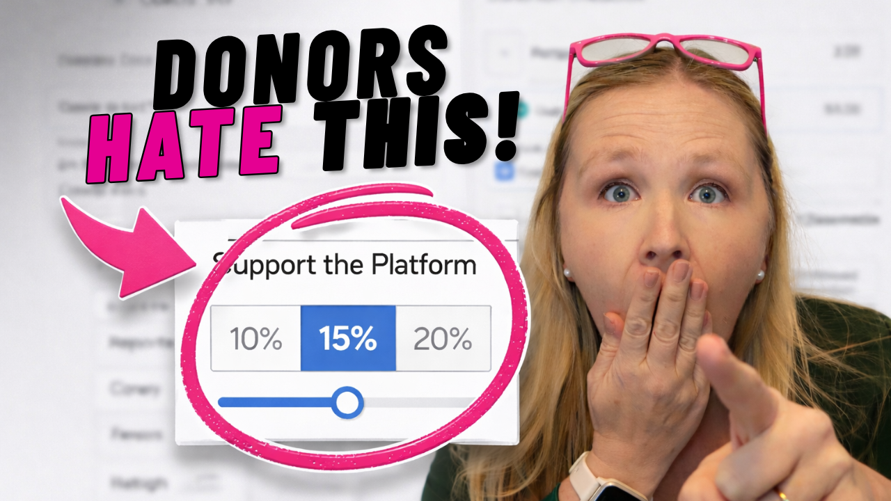
But look at how the model works. Zeffy encourages donors to leave a tip, often 15 to 20 percent. Many donors assume they are covering processing fees or directly supporting your organization. That additional money goes to the platform.
The issue is transparency. If donors feel uncertain about where their money is going, trust erodes. And trust is the foundation of donor retention.
You cannot build a sustainable nonprofit fundraising strategy on confusion. You build it on transparency, consistency, and ease.
Check out this YouTube video where Kelly Hernandez nerds out about Zeffy, “free” fundraising platforms, and what nonprofits really need to know before choosing one.
Fundraising Is Sales. And That Changes the Standard.
Fundraising is sales. You are asking someone to exchange money for impact.
That means the experience has to feel professional and frictionless. You cannot assume donors will work hard to navigate a complicated form because they believe in your mission. Most won’t. They will close the tab and move on.
When I evaluate nonprofit websites, I start with the donate page on mobile. I try to give. If the recurring option is buried, if the page loads slowly, or if the steps feel confusing, that organization is quietly losing revenue. No monthly dashboard will show you how many people abandoned the process halfway through.
How to Make the Right Decision
Stop starting the conversation with fees.
Start by testing your own experience. Pull up your donate page on your phone. Complete the form. Time it. Ask someone outside your organization to try it. Pay attention to where they hesitate.
Then evaluate platforms based on alignment with your donors’ behavior. Does it support mobile giving well? Does it make recurring gifts simple? Does it integrate cleanly with your existing systems? Does it reinforce your brand instead of distracting from it?
There are strong options available. Donorbox, Bloomerang, Givebutter, Fundraise Up, and even well-configured forms inside your CRM can work.
Your messaging can be compelling. Your impact can be powerful. Your development team can be talented. But if the final step in the giving process feels frustrating, you are leaving money on the table.
Your mission deserves better than that.
So before you debate fees again, ask yourself one question.
When was the last time you tried to donate to your own organization on your phone?
Be honest. Your next donor already is.
Check out this YouTube video where Kelly Hernandez nerds out about ethical fundraising tools and why transparency matters more than “zero fees.”